As I previously mentioned in my “Does Your Conference (Or Church, For That Matter) Really Need A Mobile App?” post, I am a firm proponent of “responsive” web design. However, while I did highlight some excellent examples of some websites that look great on mobile devices from the Minnesota, New Mexico, and Pacific Northwest Conferences, I didn’t really go into my thoughts on what constitutes a good conference website. Now, “good” can be defined in a number of ways, so I decided to build a front page based on the following points:
- For newcomers, it’s informative without being technical or overwhelming
- For church members, it’s a one-stop shop that has everything that they need
- For clergy, it has nothing they don’t already know, but everything they need to know
- It has style and content that makes it feel unique and inviting
Based on those points, some trial and error, and a good amount of research, I came up with the following design:
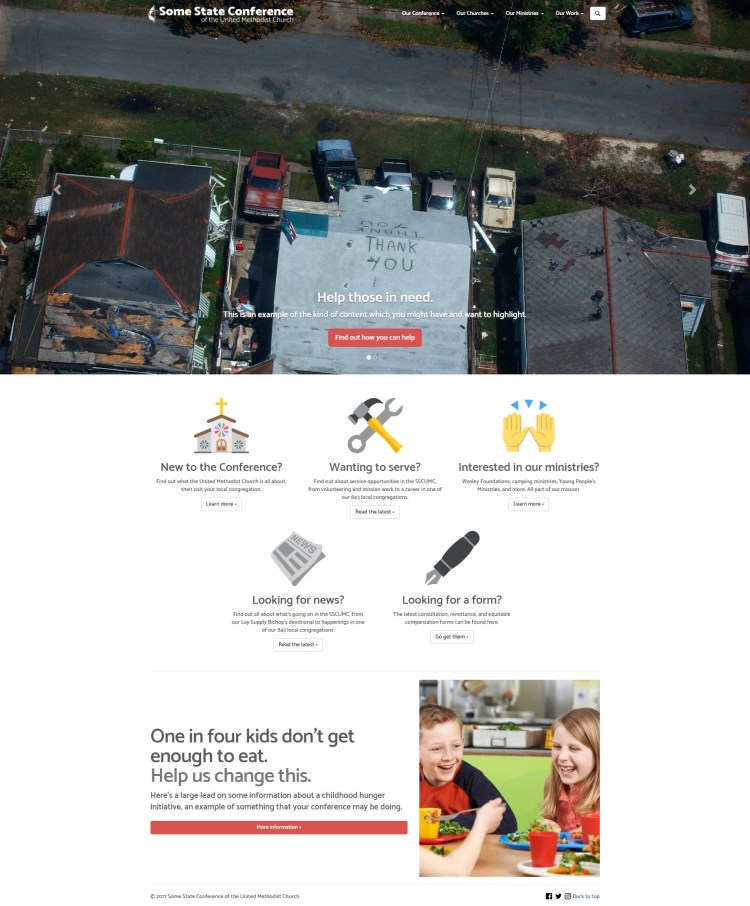
Now, for this post, I want to take this design element by element and explain why I chose all of them, so we’ll start with the big image carousel at the top.
When you first open the website, regardless of the size of the window or the device, the image carousel will encompass the screen. It’s a powerful way to draw attention to important information (in this case, disaster relief may be something your conference wants to highlight). This has actually been an idea that’s being embraced by the web design community recently, with websites like TED, which has a similar carousel, winning a prestigious Webby Award for “Best Practices” for “current, innovative, and advanced practices” on their website. However, I’ve added an additional touch by making the background of the navigation menu transparent until you scroll down, allowing for the picture to take up the whole of the screen without making the text and logo illegible if you scroll down to a white background. In addition, the menu itself has been simplified into four areas, allowing for a more human-oriented way of dividing up the information rather than relying on existing conference structures that may be confusing to newcomers and potentially even lifelong members.
Secondly, you have the group of five content areas. Instead of including individual links within each area to all sorts of different pages, I chose to segment the content to go to individual pages. This may result in an additional click for someone looking for a certain page. However, it reduces load times on your front page and keeps it clean and tidy, and that will keep people happier in the end.
Lastly, you have a “featurette” or small area of highlighted information. My example of what a good featurette might be is a conference-wide initiative. This could be Imagine No Malaria, a conference hunger relief focus, or any number of initiatives. It has a simple but eye-catching headline, a small lead, a big “call to action” button, and a nice picture or illustration on the right (multiple featurettes in a row could even alternate left and right on the picture placement). It’s short, sweet, and to the point. Wrapping up this area is the page’s footer, with social media links and a “back to top” link for convenience.
Now, in keeping with the “responsive” design that I’ve previously mentioned, I’ve also provided pictures of how the website loads on both a phone and a tablet:
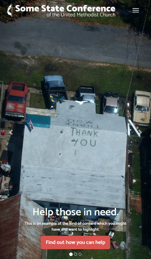
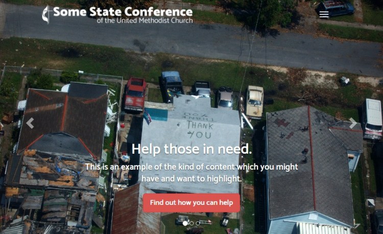
As previously mentioned, the image carousel takes up the whole of the screen, and to provide maximum legibility, the menu is collapsed, the text is resized, and the image is scaled and positioned properly. This makes your website design both consistent and stylish on any display, and again, keeps you from having to manage multiple CMSes!
Hopefully, this design provides an idea or two for your own conference or church website! Feel free to share this with anyone who you think might benefit from it! As always, I share my thoughts and research in the hopes that this ends up being of some benefit to someone, and as always I appreciate any comments or questions. Please feel free to contact me at me@jacobturner.me, or leave a comment below! I always love hearing your thoughts or what your conference is doing.
Until next time,
Jacob
Note: The example website shown was built with the Bootstrap framework and jQuery in HTML5 and CSS3, with icons provided by EmojiOne.
 JacobTurner.me